Autumn can feel like a slow dimmer switch on the soul. Days compress, inboxes expand, and the light outside your window turns the colour of old dishwater by 4pm. What helps is not always a big life change. Often, it starts with the shade around you.
The bus chugged over Waterloo Bridge, and London looked washed in pewter. In the glass, my face sat somewhere between tired and caffeinated, the city a rumour behind it. Later, in a terraced house where the hallway still smelled faintly of summer suncream, a designer rolled paint onto a test patch: a soft, smoky blue that felt like a whisper.
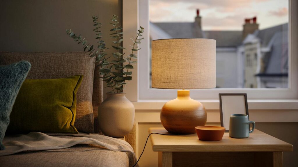
In the corner, a lamp clicked to life at 2700K, warm and buttery. The room shifted from braced to breathing. *The room exhaled.* What if relief was on the wall?
Why certain colours calm when the days draw in
The first truly cold Friday reminds you you’re a body before you’re a brain. Your shoulders rise before the commute even begins. In that moment, saturated reds and high-gloss whites feel like someone clapping by your ear, while low-saturation greens and blues feel like a hand on the back of your neck, steadying.
Sarah, a project manager in Manchester, swapped a stark cool bulb for a warmer one and painted her hallway a dusty sage. She noticed she stopped holding her breath between room and room. A YouGov snapshot last year found a rise in self-reported low mood as the clocks changed, and charities estimate around two million people in the UK feel seasonal shifts hard. A tiny change of hue doesn’t fix everything. It can help you land.
Think of colour like sound. High-contrast schemes behave like treble; muted palettes sit closer to bass. Long-wavelength ambers and ochres read to the nervous system as dusk, which cues wind-down, while icy blues can feel like a bright January noon. Mix matters as much as the notes. Two quiet tones with a single grounded contrast create a pocket of safety your eyes can rest in. **Safety, in colour terms, often looks like low glare, soft edges, and warmth.**
Build your autumn‑soothing palette
Start with one anchor neutral that carries daylight kindly. Oatmeal, mushroom, or a chalky mushroom grey will do the heavy lifting. Add two accents: one botanical (moss, olive, eucalyptus) and one atmospheric (smoked blue, stormy teal, or mauve-grey). Keep the mix simple: 60% anchor, 30% botanical, 10% atmosphere.
Test swatches on two walls and watch them from breakfast to late afternoon. The colour you love at noon can sulk at 5pm. We’ve all had that moment when the “perfect beige” turns pink after tea. Use warm lamps (around 2700K) in evenings and dim them an hour before bed to let the palette and your body agree. Let’s be honest: no one actually does this every day.
Small, repeatable gestures are the secret. Swap one throw, one lampshade, one print with generous negative space. **Minimal shifts can quieten a room faster than a grand makeover.**
“When saturation drops, heart rates often do too,” a London colour consultant told me. “It’s not about beige. It’s about softness, and where your gaze can land without bracing.”
- Anchor neutrals: oat, clay, mushroom, pebble grey
- Botanicals: moss, olive, eucalyptus, laurel
- Atmospherics: smoked blue, storm teal, mauve-grey
- Warm accents: honey amber, baked terracotta, cocoa
- Textures that help: wool, linen, matte ceramics, unfinished wood
Living with a palette that steadies your week
Colours work best when they behave like a ritual. Light the room from low to high, not the other way round. Put the warmest lamp near where you land after work, and keep cool light for task corners only. Rotate textiles with the weather: wool out when the forecast turns, crisp cotton in a drawer until April.
There’s a rhythm to it. A moss cushion by the arm of the sofa, a smoky blue mug on the table, an amber candle you don’t burn so much as let sit there and suggest Sunday. You start to notice you close your laptop at a gentler hour in a gentler hue. **You can’t outpaint stress, but you can give it fewer sharp edges to snag on.**
Homes are not galleries. They’re moving targets full of parcels, pets, and puddles of mail. Keep the palette flexible and forgiving, like a jumper you can wear three days running. On days when the sky sticks to the window, soft colour holds the room in one piece, and sometimes that’s the job.
Autumn anxiety doesn’t need a manifesto. It asks for a place the day can land without splintering. Neutral bones, botanical greens, a wash of smoke-blue sky pulled indoors, and a lick of honey to warm it at the edges. The palette is less fashion, more kindness.
| Point clé | Détail | Intérêt pour le lecteur |
|---|---|---|
| Choose a low‑saturation base | Oat, clay, or mushroom grey as 60% of the room | Makes light feel softer and mood steadier |
| Add two calming accents | Moss/olive + smoked blue/teal in a 30/10 split | Gives depth without visual noise |
| Warm your light | Lamps around 2700K, layered from low to high | Helps evenings unwind and colours read cosy |
FAQ :
- What colours soothe anxiety most in autumn?Muted botanicals (moss, olive), atmospheric blues (smoke, storm), and warm neutrals (oat, clay) tend to calm more than brights or high‑contrast pairs.
- Can I keep some bold colours?Yes, in small doses. Use a single saturated piece—like a rust cushion—as punctuation, not a headline.
- How do I test a palette without repainting everything?Try A4 sample sheets, a lampshade, and a throw. Live with them for a week and notice your evenings.
- What about small rentals with harsh overhead lighting?Bring in two table lamps with warm bulbs, add a moss or smoke‑blue textile, and lean art with pale space to break glare.
- Does black help a calming scheme?A whisper of charcoal can anchor a room—thin frames, a lamp base—but keep it matte and minimal to avoid heaviness.
I swapped my cold 4000K bulbs for 2700K and tested a smoky blue patch—your line “the room exhaled” is exactly it. Thank you for articulating why low‑saturation hues feel kinder; it’s not beige worship, it’s nervous‑system design. Definately keeping the mushroom grey.
Interesting read, but is there solid evidence that saturation directly lowers heart rate, beyond mood self‑reports? The consultant quote is compelling, yet feels anecdotal. Any studies you can link—controlled trials, not just survey snapshots?