You’ve shifted sofas, lit candles, shuffled cushions; yet something jars. The fix might be simpler, quieter and closer to the walls.
Ahead of 2026, colour forecasting takes a decisive turn from greige safety nets to blue’s reassuring clarity. Paint giant Dulux has crowned a trio of blues—Mellow Flow, Slow Swing and Free Groove—under the banner Rhythm of Blues, proposing calm without blandness and energy without noise.
Why blue is steering 2026 homes
Our homes carry the weight of busy days. Blue offers release. It signals sky, water and fresh air, so it steadies the room while keeping it lively. Dulux positions 2026 around this balance: soft relief for bedrooms and bathtubs, depth for dining corners and desks, and a charged note for play and creativity.
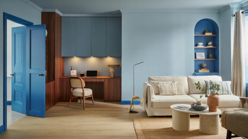
Rhythm of Blues lands as Dulux’s 2026 statement: three blue tones designed to calm, focus and lift everyday spaces.
The shift matters for people bored of taupe and anxious about bright colour. Blue slips into existing schemes, partners readily with timber and stone, and works across design eras—from pared-back flats to layered, cosy terraces.
Meet the palette: three moods, one family
| Shade | Core mood | Best rooms | Pairs well with | Light effect |
|---|---|---|---|---|
| Mellow Flow | Serene, airy | Bedrooms, bathrooms, reading nooks | Chalky whites, pale oak, linen, soft grey stone | Looks brighter in south light, restful in north light |
| Slow Swing | Grounded, cocooning | Living rooms, dining rooms, home offices | Walnut, brass, terracotta, warm neutrals | Hugs a space; deepens at dusk for drama |
| Free Groove | Playful, energising | Kids’ rooms, studios, hallways, accents | Buttery creams, zesty greens, striped textiles | Pops under daylight; crisp under cool LEDs |
Mellow Flow – soft and tranquil
This breezy blue drops the pulse without turning a room flat. It carries the feel of open sky, so it lifts small rooms and clears visual clutter. Paint walls and skirting the same shade to blur edges. Keep finishes matte to avoid glare and layer texture—slub linen, boucle, raw ceramics—for quiet interest.
Good pairing: chalky white ceilings, pale timber side tables, a jute rug. Add a single black element—lamp, frame, handle—to stop the scheme drifting into mushy pastels.
Slow Swing – deep and grounded
A rich velvet blue that anchors conversation and focus. Use it to shape a dining zone in an open-plan space, or to steady a home office where you need fewer distractions. Paint cabinetry for a tailored feel, or try it on the ceiling for a starry-night effect with soft pools of light.
Good pairing: walnut, smoked oak, aged brass and terracotta. Warm, dimmable lighting balances the depth. If you fear a cave, keep curtains lighter and add a pale rug to lift the floor plane.
Free Groove – bold and playful
This spirited tone brings movement. It sings on doors, alcove backs, stair risers and shelving. In kids’ rooms, zone a study corner with a wide colour block. In grown-up spaces, use it for the inside of a front door or a single cupboard bank for a fresh splash without repainting entire walls.
Good pairing: buttery cream, sunlit neutrals, leaf greens and striped cotton. Keep metalwork simple—brushed steel or chrome—to let the colour do the talking.
How to make blue feel warm, not cold
- Add warmth through materials: oak, walnut, rattan, terracotta, boucle and wool soften blue’s cool edge.
- Balance undertones: if your blue tilts cool, use warm whites (hint of cream) rather than stark brilliant white.
- Mind the light: north-facing rooms need warmer companions; south-facing rooms can handle fresher contrasts.
- Choose the right sheen: matte for walls to calm reflections; satin or eggshell on woodwork to bounce a little light.
- Layer blues: mix one dark, one mid, one pale for depth without introducing a new hue.
Think of blue as a backdrop for warmth: wood, wool and brass do the heavy lifting while the walls stay restful.
Paint like a pro in a weekend
Plan before you open a tin. Tape up A3 swatches and watch them for three days—morning, midday, night. Check how the shade behaves under your real bulbs. If you love two options, use both: walls in Mellow Flow, joinery in Slow Swing, for example.
- Cut in cleanly: use a short-handled angled brush and steady your wrist against the wall.
- Roll in a “W”: it spreads paint evenly and avoids tramlines.
- Respect drying windows: two thinner coats beat one heavy coat for a smooth finish.
- Sequence surfaces: ceiling first, then walls, then woodwork for crisp lines.
- Ventilate: blue deepens slightly as it cures; give it 24–48 hours before judging the final shade.
Zoning and flow: use all three without chaos
One palette across a home builds rhythm. Assign roles: Mellow Flow for rest zones, Slow Swing for focus and evening rooms, Free Groove for movement points—hallways, doors, the inside of shelves. Keep repetitive elements—skirting colour, handle finish, curtain headers—consistent to stitch rooms together.
For open-plan spaces, paint a full-height block in Free Groove to frame a desk or reading chair while keeping the main walls calm. Alternatively, use Slow Swing on the lower third of a wall (a wide “dado”) with Mellow Flow above for a classic-modern split.
Rental and low-commitment ideas
- Colour on objects: paint a freestanding bookcase or a plywood headboard in Free Groove.
- Textile storytelling: cushions in Mellow Flow, a throw with navy stitching, and a striped runner pull the scheme together.
- Poster frames and lamp shades: swap black frames for deep blue; wrap a drum shade in linen matching your wall swatch.
- Peel-and-stick panels: create a removable blue “headboard” shape or an arch to anchor a console table.
Lighting and the science bit
Colour shifts with light temperature. Warm white bulbs (around 2700K) enrich Slow Swing, making it feel luxurious. Neutral whites (3000–3500K) keep Mellow Flow crisp without sterility. Cool whites (4000K and up) punch Free Groove for a studio vibe. Mix sources—pendants for general wash, floor lamps for pools, task lights for reading—so blues never flatten.
If you watch numbers, the idea of light reflectance value helps: paler blues reflect more light and can lift tight hallways; dark blues absorb light and tighten focus. You don’t need the exact figure—just test a large swatch and note how it changes from morning to night.
What this means for your existing scheme
Blue plays well with what you own. If your sofa is greige, Mellow Flow adds clarity without clashing. If your kitchen is white, a Slow Swing island provides instant gravitas. If your hallway feels anonymous, paint the inside of your front door in Free Groove and echo it on the stair runner edge.
Three shades answer three needs: rest for bedrooms, focus for work and dining, and play for the spaces in between.
Extra ideas worth trying
Test the palette on woodwork rather than walls. Blue skirting and architraves around off-white walls flip the usual logic and give period detail a fresh purpose. Or run a deep blue picture rail to shorten a very tall room and make it feel intimate after dark.
If you live with small children, choose wipeable finishes on doors and lower walls. In studio corners, pin a fabric panel in a matching blue behind your desk to reduce glare on screens. For a fast weekend lift, paint a single large canvas in your chosen shade and hang it above the sofa to trial the mood before committing to four walls.
Love the idea of “Rhythm of Blues”—calm without blandness. Free Groove on a front door with chrome hardware sounds like instant mood-lift.
Isn’t this just rebranding navy and light blue for the zillionth time? What makes Slow Swing any differrent beyond marketing copy?