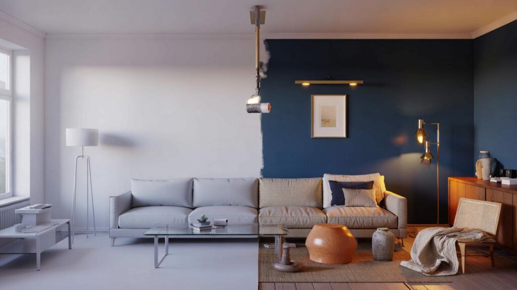
You bought cushions, throws and lamps, yet your rooms still feel flat. The missing piece might be on the walls right now.
Across 2026, one colour is quietly transforming ordinary homes: deep ink blue. It steps in where white falls short, adding gravity, warmth and a sense of intent that reads as instant sophistication.
Why deep tones change how you feel at home
For years, white promised brightness and calm. In practice, it often leaves rooms echoey and anonymous. Deep colour behaves differently. It hugs the edges of a space, softens daylight, and frames furniture so it looks chosen, not just placed. The effect feels intimate rather than empty.
Psychology helps explain it. Saturated blues slow the eye and steady the mood. They mark a boundary between outside bustle and private life. You linger longer in a room like that, and you notice texture, timber and artwork because the backdrop stops shouting.
A low-LRV, saturated wall colour can make affordable pieces read as deliberate and curated, not temporary.
If you live with a lot of screen glow and hard flooring, a deep wall absorbs glare and hushes noise. That alone can make an evening feel more grown-up and less like a waiting room.
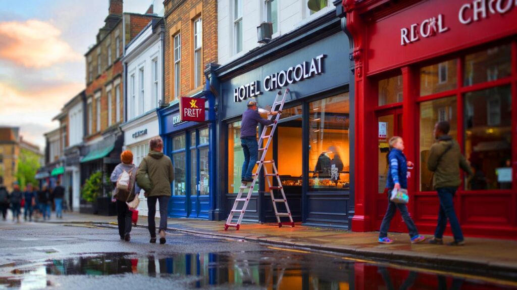
Meet 2026’s hero shade: ink blue
Ink blue sits between midnight navy and strong cobalt. It carries a charcoal whisper rather than a purple wink, which keeps it elegant. Think of fountain-pen pigment on thick paper. It is dark, yes, but not dour. Under warm light, it turns velvety; in daylight, it feels crisp and architectural.
What it looks like
The most versatile inky blues have a green-grey undertone and a low light reflectance value (LRV) around 5–10. That means they absorb a lot of light, which is exactly why they look expensive when balanced with warm lamps and tactile fabrics.
For a refined look, aim for an inky blue with LRV 5–10 and a subtle green-grey undertone rather than purple.
Why it flatters most rooms
Small rooms gain character and apparent order, because the boundary becomes a chic envelope. Larger rooms feel less cavernous. The colour loves natural materials:
- Oak, ash or cane introduce lightness and grain.
- Brass and aged gold bounce warmth back into the scheme.
- Linen, bouclé and cotton add air and touchability.
- Terracotta, clay and stone give a grounded counterpoint.
- Honey leather lifts the palette without fighting it.
It also supports artwork. Pale frames or off-white mounts pop against the depth, so prints look gallery-ready without elaborate styling.
How to use it without shrinking your space
Smart placement
- Feature wall: paint the wall behind a sofa or bed to zone the room and anchor the layout.
- Colour drench: in tall rooms, carry the blue onto skirting and doors for a cocooning, boutique-hotel feel.
- Half-height: paint to picture-rail level and keep the upper wall warm white for balance.
- Architectural nooks: treat alcoves, shelves, or a fireplace breast for depth without overwhelming the plan.
- Woodwork flip: keep walls soft neutral and paint doors, architraves and radiators in ink blue for a tailored twist.
Finishes that work
| Finish | Best for | Effect with ink blue |
|---|---|---|
| Matt | Living rooms, bedrooms | Softens light, hides minor wall marks, velvety depth |
| Eggshell | Kitchens, hallways | Wipeable, slight sheen lifts darker hues |
| Satin | Woodwork | Defines edges, reflects warm highlights from lamps |
| Gloss | Front doors, accents | Statement shine, best used sparingly |
Common mistakes and easy fixes
- Painting every wall in a tiny, dim room. Fix: limit the blue to one or two walls and use warm off-white elsewhere.
- Cold bulbs. Fix: choose 2700K–3000K lamps and layer floor, table and wall lights.
- Too many competing darks. Fix: pick one hero dark, then build a calm base of natural tones.
- Flat textures. Fix: add woven shades, wool throws, ribbed ceramics and boucle to bring movement.
A two-week plan and rough costs
This timeline suits a lived-in room without turning your home upside down.
- Days 1–2: Test three sample pots on A3 cards. Move them around morning and evening. Choose the one that stays rich at night.
- Days 3–4: Order paint and brushes, wash walls, fill holes, sand lightly, dust off, and mask.
- Days 5–6: Prime any stained patches or bare plaster. Cut in edges, then roll coat one.
- Days 7–8: Apply coat two. Remove tape while paint is just tacky.
- Days 9–10: Swap bulbs to 2700K, add two more light sources, style with one new cushion or throw for texture.
- Days 11–14: Rehang art with lighter mounts; add a brass tray, clay vase, or honey-leather strap to echo warmth.
Typical UK spend for one wall (approx. 10–12 m²):
- Paint (2.5L quality matt): £28–£65
- Primer and fillers: £12–£30
- Brushes, roller, tape, sheets: £20–£40
- Optional new lampshade or bulb set: £18–£60
On a sub-£150 budget, one inky wall plus warmer lighting can read as a complete room upgrade.
Lighting and styling that make the blue sing
Light decides whether deep colour looks moody or muddy. Aim for three points of warm light: a floor lamp to wash the wall, a table lamp for human-scaled glow, and a directional light for reading or art. Metal finishes matter too. Brass and bronze warm the blue; chrome looks colder but can work if you add texture in textiles.
Layer tactile surfaces. A nubbly linen curtain, a wool rug and a ribbed ceramic vase prevent the scheme from feeling flat. Keep mirrors strategic; one tall mirror opposite the darkest wall bounces light back without diluting the drama.
Think 2700K–3000K bulbs, three light sources, and one textural hero per view; the blue does the rest.
If blue is not your thing
You can still leave white behind. Try forest green for a botanical calm, aubergine for a plush dining nook, oxblood for depth with energy, or mineral charcoal for a smart edge. Match undertone to your light and furniture: green for warm timber, charcoal for crisp monochrome, terracotta for earthy textiles.
- North-facing rooms: choose a green-leaning navy or moss to counter cool light.
- South-facing rooms: a true ink or charcoal keeps glare in check.
- Rental-friendly: paint a large canvas or MDF panel in inky blue and prop it behind the sofa.
Extra tips you will thank yourself for later
Test colour large and vertical. A postcard dab misleads; use at least A3 size and check it at night with your actual bulbs. If you have radiators on the feature wall, paint them to match; they disappear and the room reads calmer. Consider VOC levels if you have babies or pets; many modern low-odour ranges perform well in deep colours.
For a quick win in a 12 m² bedroom, paint the headboard wall, switch to warm bulbs, and add a single brass swing-arm lamp. The bed looks bespoke, the room feels composed, and you gain a night-time cocoon without new furniture. In a hallway, inky woodwork and a pale wall make even budget runners and simple hooks look intentional.
Tried this last month: inky blue (LRV ~7) on the headboard wall, swapped bulbs to 2700K, and suddenly the cheap pine looks curated. The room feels calmer, the art pops, and even the radiator disappears when painted to match. Definately keeping the matt finish—velvety, hides sins.