After seasons of beige and greige, a new palette is quietly stealing in, promising softer rooms and steadier daily rhythms.
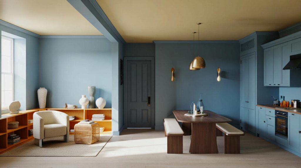
Blue is stepping forward in British homes for 2026, with Dulux naming a trio of shades under the banner Rhythm of Blues. The three colours — Mellow Flow, Slow Swing and Free Groove — promise calm, character and easy pairing. They signal a clear move away from grey-taupe routines toward hues that steady busy households without dulling personality.
Meet the three blues shaping 2026
Mellow flow: soft, airy calm
Mellow Flow reads like coastal light on a mild day. It brings ease to bedrooms, small living spaces and home libraries. On walls, it reduces visual clutter and helps a room breathe. In north-facing spaces that skew cool, it still feels hospitable when paired with warm whites, oatmeal linens and honey-toned oak. Use a mid-sheen on woodwork to add a subtle lift without glare.
Mellow Flow works where you need headspace: think sleep zones, reading corners and spa-like bathrooms.
For rental-friendly changes, try it on a freestanding wardrobe or a headboard. The gentler value means it plays well with textured plaster, boucle upholstery and chalky ceramics. If you’re worried about light absorption, place it opposite a window and keep ceilings a soft off-white to bounce daylight back.
Slow swing: deep, grounded confidence
Slow Swing sits in the navy family with a velvety undertone. It anchors dining rooms and evening lounges. One accent wall can frame a fireplace or media unit; a full wrap creates an intimate, clubby mood. The colour thrives with brass, walnut, and deep pile rugs. Balance the depth by increasing lamp levels: aim for three light sources per room — ceiling, task and ambient.
Use Slow Swing to zone a space: behind a sofa, around a banquette, or across a home office wall for focus.
Keep skirtings and architraves a warmer white to avoid a harsh edge. In compact rooms, paint doors in the same colour as the walls to simplify lines and make the envelope feel cohesive. Matte finishes minimise reflections and enhance the plush look.
Free groove: playful, creative energy
Free Groove brings a brighter, carefree charge. It suits children’s rooms, craft spaces and sunny kitchens. Treat it as a highlight in a neutral scheme: stools, a larder door, staircase spindles or a painted ceiling can all carry the shade. Pattern welcomes it — stripe bedding, gingham napkins, or graphic tiles keep the mood upbeat without tipping chaotic.
Free Groove adds punctuation. Use it in short bursts to spark a scheme without overpowering it.
If you want bolder coverage, choose a scrubbable emulsion to stand up to fingerprints and crayons. Pair with terracotta pots, mustard textiles and woven baskets for warmth and a lived-in feel.
Why blue now
After years of grey, homeowners want colours that calm the pulse yet still feel optimistic. Blue links straight to the outdoors: open sky, deep water, clear air. That connection reads as relief in fast, screen-heavy lives. Softer tints hint at morning light and fresh starts. Darker blues offer a night-in mood that steadies nerves and frames conversation. A more spirited blue brings play and momentum. Together, the trio maps neatly onto daily rhythms — rest, focus, fun.
Rhythm of Blues offers one language, three tempos: serene, grounded and lively — easy to mix across real family routines.
Quick guide to pairing the three shades
| Shade | Mood | Best rooms | Pairs well with |
|---|---|---|---|
| Mellow Flow | Light, soothing | Bedrooms, bathrooms, snug lounges | Warm whites, oak, rattan, linen, pale stone |
| Slow Swing | Deep, reassuring | Dining rooms, libraries, home offices | Brass, walnut, boucle, wool, textured plaster |
| Free Groove | Bright, playful | Kitchens, kids’ rooms, studios | Terracotta, mustard, chalky neutrals, stripes, tiles |
Get the look without repainting everything
- Test large swatches: paint two A3 sheets with two coats; move them around at breakfast, midday and evening.
- Start with woodwork: a blue on internal doors or skirting can refresh a hallway fast.
- Try a ceiling: a pale blue lid in a small room softens corners and heightens perceived space.
- Use fabric first: cushions, throws and lampshades in similar tones preview commitment before walls.
- Balance temperatures: add warm metals, rustic timber and woven textures so blues stay friendly, not chilly.
Design moves that never fight
Contrast undertone with undertone. If your room has cool northern light, choose warmer whites around Mellow Flow. With Slow Swing, mix in caramel leather or oxidised brass to avoid a corporate navy feel. Free Groove loves tactile neutrals; think sisal runners and limewashed walls for depth without noise.
Mind sheen levels. Matte on walls carries colour with composure. Satin on trims gives definition. High-gloss on a single element — a side table or a banister — adds a crisp accent that lifts darker blues.
Common mistakes and easy fixes
- Too stark a white with navy: switch to a soft white with a hint of cream to avoid a cold contrast.
- Ignoring undertones: sample next to flooring and stone; some blues lean green, which may clash with pink-beige carpets.
- Patchy finish: always prime over strong colours or fresh plaster; two even coats beat one heavy pass.
- Dark room, dark paint, no plan: increase layered lighting and reflective surfaces when choosing Slow Swing on four walls.
- Accent overload: limit Free Groove to two or three touchpoints per space for a cleaner rhythm.
What this shift means for your budget
Blues stretch further than most accent colours because they partner with existing neutrals. You can keep sofas and curtains, then update walls, rugs and a few accessories. Kitchens gain impact from painting only the island, a dresser, or open shelves. Bathrooms benefit from a blue vanity with the walls left off-white — small changes, strong effect.
Sustainability and health checks
When sampling, look for low-VOC or water-based formulations to reduce odour and speed up drying. Ventilate well and schedule painting for a day when you can keep windows open. For nurseries or playrooms, check wipeability ratings; tougher emulsions extend the life of a bright feature wall.
A little colour science to steer your choice
Light Reflectance Value (LRV) helps predict brightness. Higher LRV colours, like Mellow Flow, bounce more light and suit compact rooms. Lower LRV colours, like Slow Swing, absorb light and create a cosier wrap. If you mix all three in an open-plan area, let the palest tone carry the largest wall area, then use the darkest to zone and the brightest to accent.
Try a weekend test. Paint sample boards and photograph them at 8am, 1pm and 8pm from the same spot. Your phone gallery will reveal shifts in tone and saturation across the day. Choose the shade that still feels balanced in the worst light your room receives, not only at its best.
Mellow Flow for a north-facing bedroom sounds perfect — love the tip about warm whites and honey-toned oak. Trying this next weekend! 😊
Is “Slow Swing” just… navy with better PR? Not complaining, just a tad sceptical.