A wave of deeper colour is rolling through British homes this year, nudging neutral walls aside and reshaping our rooms.
Designers say the fast track to a warmer, smarter-looking space isn’t another cushion or lamp. It’s a single, gutsy wall colour that frames everything you already own, lending weight, warmth and balance without a pricey refit.
Why deep tones are overtaking blank white walls
For years, white promised light and empty calm. It also left many rooms feeling flat. Deep, saturated tones change the script. They add shadow, contrast and a sense of intention. Objects sit more confidently against a coloured ground. Timber looks richer. Metals glow. Textiles gain depth and texture.
In 2026, the shift feels visible. Retail displays lean darker and duskier. Show homes push character. People want living spaces that slow the pace and feel cocooning on shorter days. Colour helps achieve that without more stuff.
Dark, enveloping paint creates a backdrop that makes ordinary furniture read as curated, and ordinary light feel theatrical.
The 2026 hero shade making homes look twice as chic
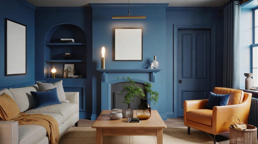
The shade drawing the most attention is ink blue. Think a midnight-leaning navy with a touch of cobalt energy, not gloomy, not greyed out. It brings calm and order to busy rooms and adds quiet drama to sparse ones. In paint terms, it often sits at a low light reflectance value (LRV) of around 8–12, which means it absorbs glare, softens edges and pushes walls visually outward, not inward.
Ink blue suits British light. Under soft daylight it feels plush and velvety. Under warm bulbs it glows with a subtle marine depth. It flatters oak, walnut, rattan, linen, brass, stoneware and honey leather. It makes artworks pop and plants look lusher.
How to use ink blue without shrinking your space
- Zone with intention: paint a single chimney breast, alcove, headboard wall or dining niche to anchor the layout.
- Balance with pale partners: pair with warm off-whites, stone, greige or natural linen for breathable contrast.
- Layer lighting: mix a central pendant with two low-level lamps; add a picture light to graze texture.
- Echo the blue: repeat the tone in a throw, a vase or a frame to stitch the palette across the room.
- Mind the sheen: choose matt or eggshell on walls to keep the look plush and reduce reflections.
Lighting and finish: the science behind the glow
Ink blue thrives under warm, indirect light. Aim for bulbs at 2700K–3000K. Use 400–600 lumens per small lamp and dimmable drivers for flexibility. On walls, a durable matt hides minor imperfections and gives that inky effect; on woodwork, eggshell adds a gentle lift without turning glossy.
| Room | Coverage | Pair with | Lighting | Finish |
|---|---|---|---|---|
| Living room | 1–2 feature walls | Oatmeal sofa, brass accents | 2700K lamps + dimmer | Matt walls, eggshell skirting |
| Bedroom | Headboard wall | Linen, oak bedside tables | Warm bedside lamps | Wipeable matt |
| Hallway | Lower third (dado) | Soft white above, sisal runner | Wall washers | Hardwearing eggshell |
| Dining | All walls | Smoked glass, stoneware | 3000K pendant over table | Matt |
Sample first: paint 1 m² swatches in two spots and check them at 8am, midday and 8pm before committing.
A weekend plan: under £200, high impact
Most British rooms need 2.5–3.5 litres for one deep-colour feature wall. Add primer if you’re covering bright white or a glossy finish. Rollers, sleeves and decent tape matter more than fancy gadgets. The job fits into a single weekend.
- Paint (3L, quality mid-range): £48–£78
- Primer (2.5L, stain-blocking if needed): £20–£35
- Roller set, angled brush, tray liners, tape: £18–£30
- Dust sheets, filler, sanding pads: £10–£20
- Total typical spend: £96–£163
Time plan: one hour for prep, one for cutting-in, two for coat one, dry, then a final coat in another two. Add an hour for rehanging frames and styling. If you rent, try peel-and-stick panels or paint a freestanding screen to sit behind a sofa or bed. The visual impact reads the same in photos and in person.
Common mistakes that make dark paint feel heavy
- Painting all four walls in a tight box room without adding warm light sources at different heights.
- Using cool 4000K bulbs that turn blue tones steely and hard.
- Skipping undercoat on fresh plaster or gloss, leading to patchy absorption.
- Cluttering the focal wall; let 40–50% of it breathe so the colour can do the work.
- Mixing several competing deep colours without a unifying neutral or timber tone.
What ink blue does to your existing furniture
White IKEA pieces can look sharper against ink blue, not cheaper. The contrast adds a gallery-like crispness. Mid-century teak feels warmer. Chrome or nickel fittings gain definition. Rugs with a hint of rust, terracotta or muted coral sing, because orange sits opposite blue on the colour wheel. Even simple cotton curtains take on a hotel softness when they hang against a deep backdrop.
Materials and textures that shine next to ink blue
- Brass or antique gold frames and lamps for a gentle glow.
- Chunky knits and bouclé to add softness against the smooth wall.
- Unglazed ceramics in sand and clay for earthy balance.
- Leather in tan or cognac to bring warmth and patina.
- Artwork with white mounts to pop crisply against the blue.
Practical extras you asked for
Worried about maintenance? Dark matt finishes can mark, so pick a washable matt for high-traffic zones. Keep a labelled jam jar with 150 ml of leftover paint for quick touch-ups. Roll touch-ups feathered from the centre of the mark outward to avoid tide lines.
Concerned about resale? Deep colour photographs beautifully for listings. If needed, returning to a pale neutral takes one high-opacity white undercoat plus one finish coat when you use quality gear and proper drying times.
Unsure of the exact shade? Compare two inks: one with a green undertone (calmer) and one with a violet tilt (richer). Hold them against your flooring and sofa fabric. The undertone that flatters both wins. If your room faces north, choose the warmer ink; if south-facing, the cooler option keeps things fresh.
Want the effect without repainting walls? Try a single large blue element: a sideboard resprayed in ink, a painted door, a low bookcase, or a folding screen. The eye reads that statement as architecture, and the rest of the scheme takes its cue from it.
One bold move delivers the lift: a single ink blue plane can make a £300 sofa read like a £900 one.
A quick testing routine that actually works
Order two peel-and-paint cards or tester pots. Paint 50 cm squares on lining paper, not directly on the wall, and move them around. Watch them at breakfast, lunchtime and after sunset. Take phone photos on auto mode; your camera exaggerates contrast, which is useful for spotting undertones you might miss with the eye. Choose the card that still looks balanced under your evening lamps, because that’s when the room does the most hosting.
If you go all-in
Large rooms with good daylight can take a full wrap of ink blue. Treat skirting and doors in the same colour, one sheen up, to elongate the walls and erase visual clutter. Keep ceilings a soft white for lift, or drop them 10% of the wall colour to lower a very tall room and make it feel intimate. Style with three finishes only: timber, a touch of brass and one natural textile. That restraint keeps the scheme calm, not themed.
Tried an ink blue feature wall last weekend, paired with brass lamps at 2700K—wow, my cheap sofa looks like it got a pay rise 🙂 The LRV ~10 tip really softened edges and made everything feel calmer.